the only thing i wish i could have done was do the parallax for the backgrounds myself but alsa i didn't have time to do that.
Title sequence
the only thing i wish i could have done was do the parallax for the backgrounds myself but alsa i didn't have time to do that.
Experimental PhotoShop Figure
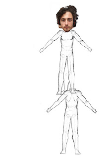
now these figures are all cut up and everything but i have put them together so that he won't act like an actual pain moving around the place i did multiple angles but i stuck with the front view and the side view, the side view is behind the front view for the reason i stated above. i had left the construction lines in because i think it adds to the personal side of my experimental, that and the devilishly handsome mug on top. as i have started on the animation already i would like to have cut the pieces a lot better and had better pieces to work with other wise i think i would do it almost exactly the same if i were to do this again.
the head being grossly out of proportion is also a little spice to give it some character, as it is otherwise just a blank character.
Background Designs
these are the designs for the title ssequence backgrounds, the idea was to give an suggest as to what the backgrounds could be like. most o the inspiration was from A guy called Jean Giraud's comic called Moebius, it had this awesome late 1800's scifi feel to it that i just love, and as it fitted in with the theme of the title sequence, yesterdays tomorrow, i felt the free reign to use the influence this had. the designs were also inpart a way for me to copy the style as i felt it fitted, so i copied a the pictures but i would not beusing this layout in the end. another thing was that we weren't using the same setting i couldn't use moebius for all of the bckgrounds.
the Ballons were just plae holders till we igured out what we wanted the ballon to actually look like, how ever i did use Albert Robidia a a reference to the design and probably for future designs for the backgrounds.
the main problem with my drawings is my style, it is to sketchy, the lines are rough ad there are threads of lines coming out of the main lines. this is a problem that can only be solved through time and practice, so there is little i can do there.
as for the difference in detail, that is more to do with time managment. simply put it i couldn't spend all of my time on these as i have lot of other stuff to do, and as it is i have probably spent too much time on this as it is.


Windy Walk
this was a walk cycle that i did, as of my own initiative.what i was trying to achieve was a parlax, and a cape billowing in the wind. no i failed at the paralax, as i had no idea how to do it, as i attempted this before the lessons in which we started to learn paralax, however i did the cape billowing in the wind very well, however it does grow and shrink from the start of the cycle to the end. this came about as a result of not fully payning attention to the length of the cape with each frame. dispite that it does move like a cape would in heavy wind, the next type of cape billow would be a cape of prestige, a cape gently billowing rather than what you can see above.
apart from all of that i accidentilly got the figure walking in strong wind right, as it does look like the figure is struggling to keep going against that wind.
the representation of the wind sucks, i admit, but that is probably a result of me not knowing how to do wind, and hopefully i would be able to learn at some point in time.
over all it works as a little personal progect when i still had time to spare, and i did achive the main part i set out to achive with that animation.
epic skip cycle
over all i think it works and looks great however, the teacher said the animation method is a too difficult a method to get right with a beginner animator.
Walk Cycles
The top cycle is meant to be of a four legged animal, so i used a dog walk cycle as reference, however i designed the animal to be a lot easier to animate than a dog. in hindsight the walk cycle is very similar to two, two legged walk cycle next to each other except they aren't moving in tandem. now i made a mistake and had a fore leg bend more than it needs to throughing, however this is very hard to see, especially if you don't know how to loop the video. i added white highlights to make the creature a little more interesting even if it makes it boil, but as i still need to work on preventing the boiling effect that my style has, the highlight made the nimal look much better.
over all i think it worked, but i know it is just one animal walk cycle out of many, its just good to understand the idea.
the foreward walk cycle. this was relatively easy to understand after doing the walk cycle last term. however the wierd figure shape was a way to prevent the boil of the figure from happening, also to make animating it easier, as having my usually style figure would have been a little too much effort for that week, and also a result of a sugestion from the teacher. the legs definitly look like they re going backwards in space as the figure takes the steps, and having the arms swing infront of and behind the figure helps make them appear to go forewards and backwards in space. the timing seems to work, as the figure has an exagerated walk style.
overall i think it shows i learnt hat type of walk cycle, at least for the mle version, if i had time i would go over it with a better design for the figure.
Lip sync
Project was based on lip syncing and how to go about it. however another element was added, and that was inbetweening someone elses animation, so we get to know what its like. this one is the one i inbetweened. the original character design and spacing was done by a friend.
I synced up the audio with the lips, i think i did well, but having the mouth stay open long enough to be seen and keep up with the audio was hard, in retro spect i would s have the voicing to be slower, as to allow the different lip possitions to be seen. another problem was the box head. he had no mouth to animate for this lip sync project, so to solve that i had the box verberate, as all the box head really says is 'no'. I also added the shaking of the fist, it was a flare that i thought fitted with the shouting of the no. And the other part i added was the colour. I found out that the colour had to be the last thing added, other wise the colours won't match up to the forms, and inbetweening would be a nightmare.
Experimental
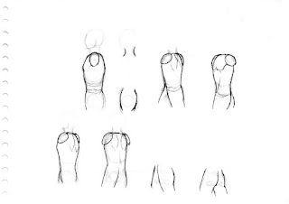
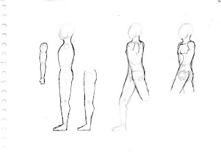
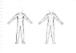
Now yes i would love to show the original designs and figures i drew, however, in a fit of rage i seemed to have destroyed them. You see i was stressed that i hadn't the time to actually do my original plan and combining that with the realization of the impracticality of my idea, drove me to destroy it thinking it was useless and wouldn't help me in any way shape or form. yeah the experimental for me was a real failure.
these however are the designs that i drew out on paper which i would then cut out on Photoshop, which will then be transferred to celaction and used to animate with. they are simple designs with the head not being inked because i was going to us my actual head photoed and plonked on-top.
if i were to do this again, i would draw each piece independently or cut up independently giving nicer shapes to animate with other wise i think it worked well for what it was
Subscribe to:
Comments (Atom)


